Artisan Bloom
Branding

The Concept
The concept, “Creativity in Bloom,” uses a floral metaphor to represent the growth of ideas, artistic expression, and human connection. This idea guided all visual decisions, from the logo to the supporting graphic elements.
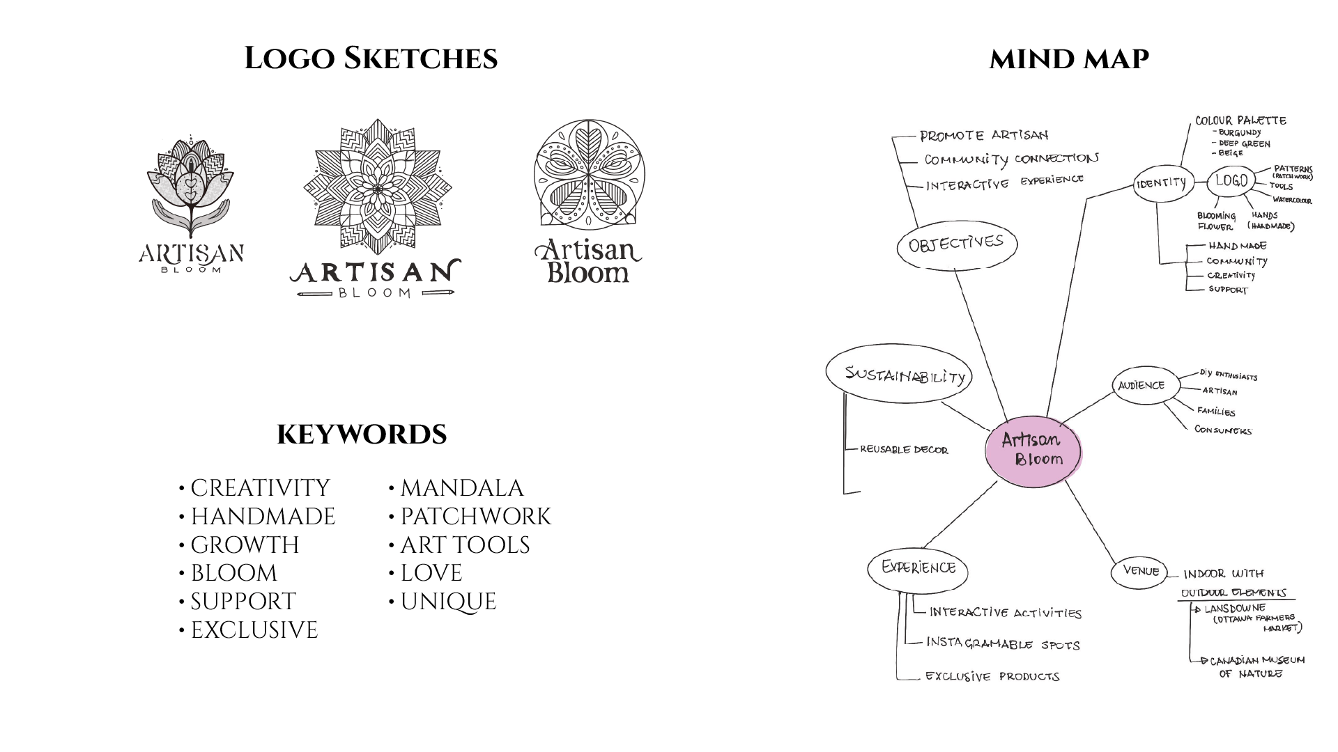
Logo
The logo combines overlapping petals, a central pencil symbolizing creativity, supportive hands (leaves) representing community, and a subtle heart that reflects the passion behind handmade artistry.
Colour Palette: Burgundy, orange, and green accents evoke warmth, vibrancy, creativity, and a connection to nature.
Typography: The name “Artisan Bloom” is styled using a combination of fonts. For “Artisan,” the Cinzel typeface was chosen for its elegance and calligraphic glyphs, with slight customization to resemble stencil-crafted lettering and better align with the spirit of the event. Raleway, a clean and modern sans-serif, was used for “Bloom.”
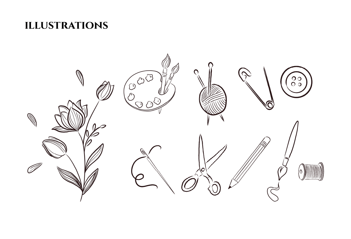
Illustrations
Custom hand-drawn illustrations were developed to reinforce the handmade and creative spirit of Artisan Bloom. Inspired by traditional craft tools and organic floral elements, the illustrations represent different forms of artistry while maintaining a cohesive visual language. The loose linework and slightly imperfect strokes evoke an artisanal, human touch.
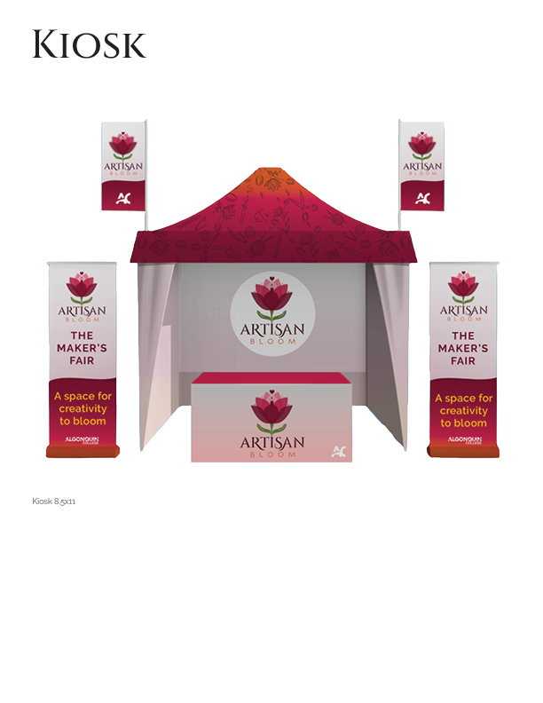
Applications
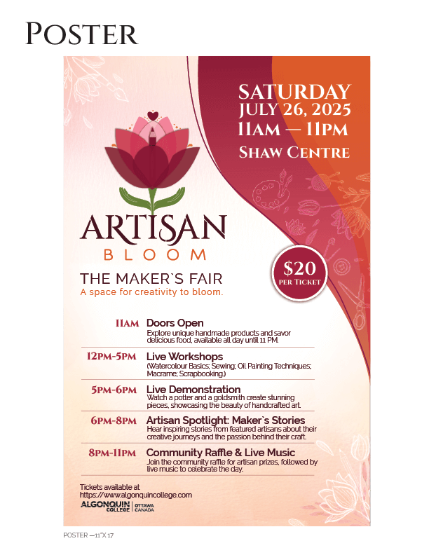
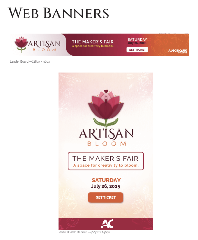
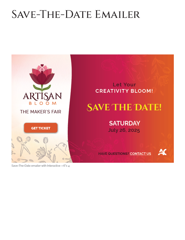
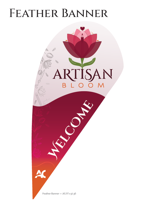
Brand applications across key print and digital materials.