Viva Brazil Festival
Branding

The Challenge
Create a vibrant and cohesive visual identity that could capture the energy, diversity, and emotion of Brazilian culture while remaining functional across multiple festival applications. The challenge was to design a flexible system—including logo, color palette, icons, and signage—that worked consistently in both digital and physical environments.
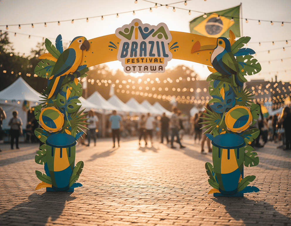
Another key challenge was developing a custom logotype that balanced playfulness and clarity, ensuring strong legibility at small sizes while expressing movement and celebration. The design needed to scale effectively for posters, merchandise, tickets, directional signage, and large photo-op installations.
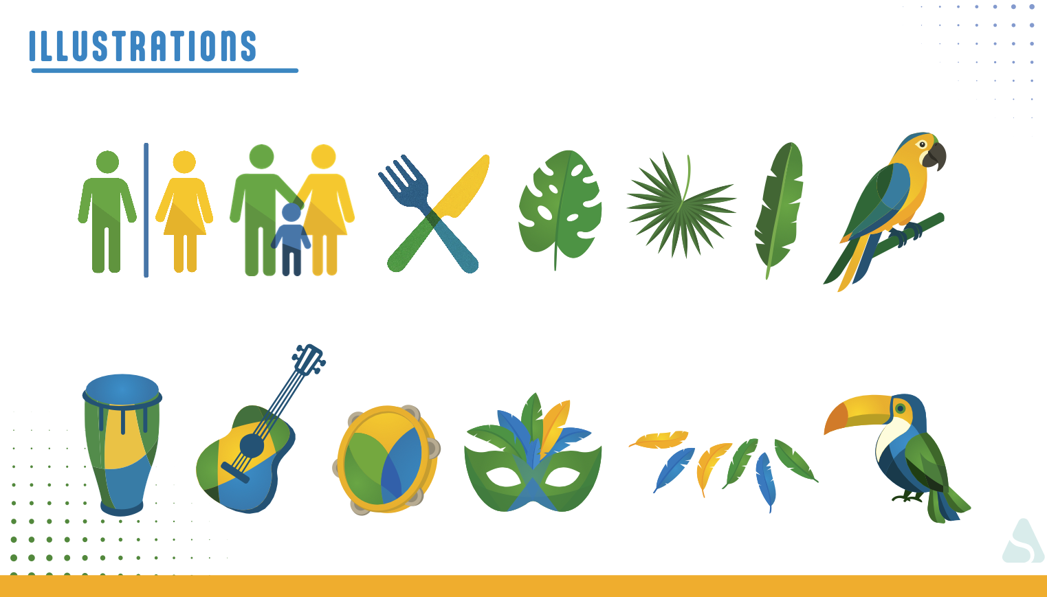
Illustrations
The illustrations were created to visually express the festival’s spirit of joy, culture, and community. Using bold shapes, layered transparencies, and a vibrant palette inspired by the Brazilian flag. The geometric style ensures consistency across icons, patterns, and decorative elements, allowing them to scale seamlessly for signage, merchandise, digital assets, and large-format installations.
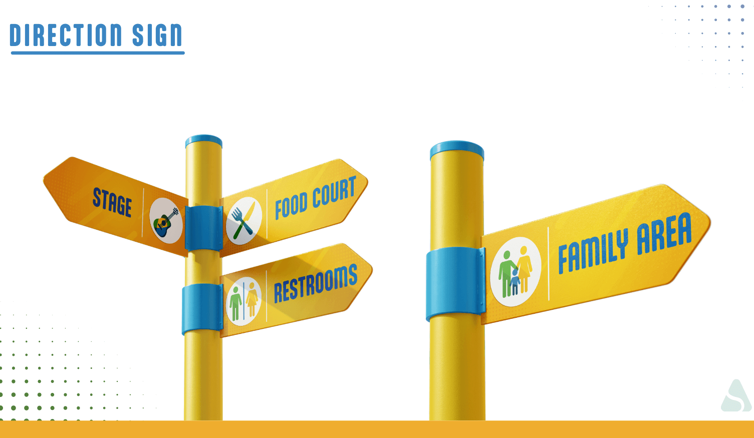
Direction Sign
The visual identity was extended into clear and engaging directional signs, ensuring an intuitive experience for festival visitors. Bold colors, accessible iconography, and high-contrast typography helped guide attendees through key areas such as the main stage, food court, restrooms, and kids’ zone.
Applications
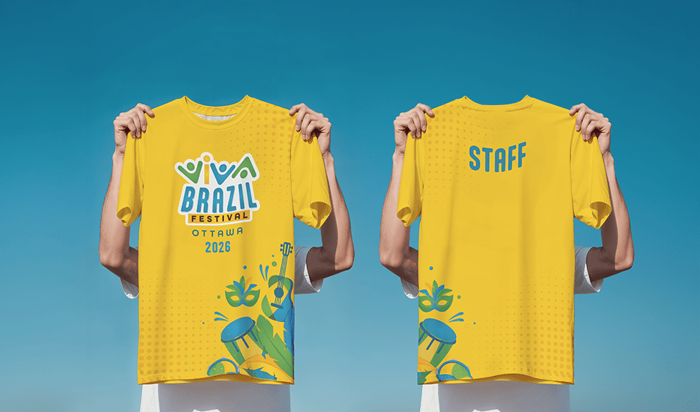
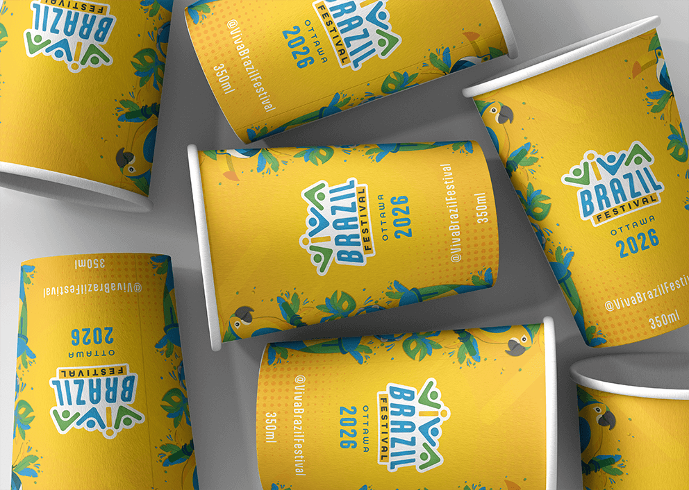
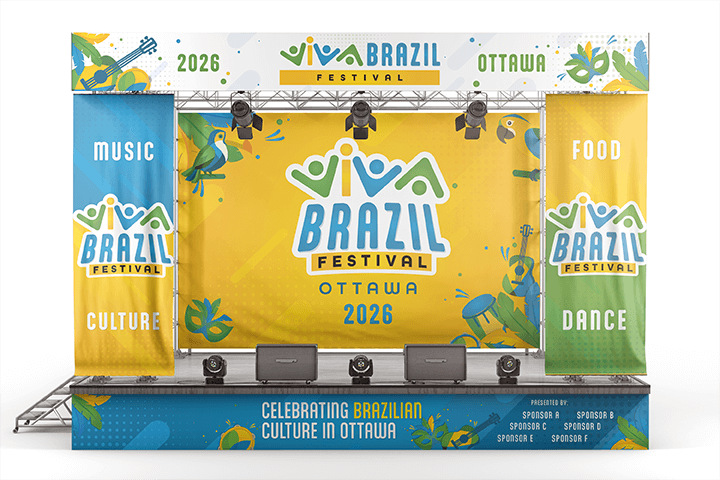
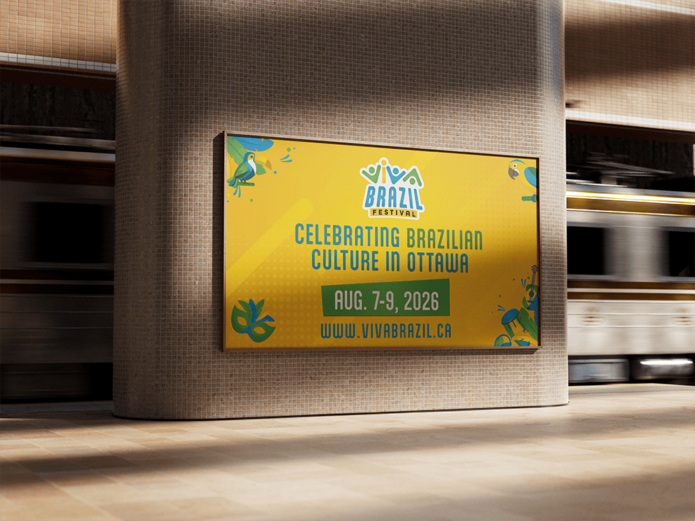
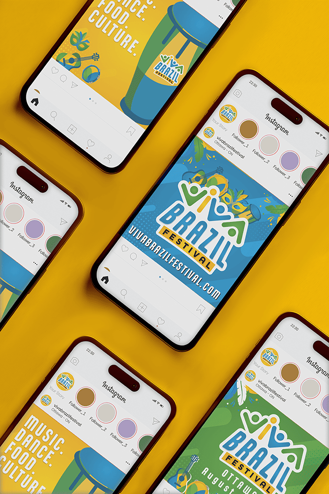
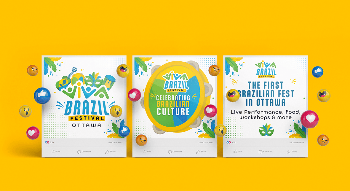
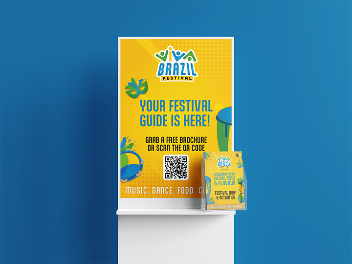
Additional applications, such as tickets, billboard, merchandise, stage visual, and photo-op installations, reinforced the brand’s vibrant energy and maintained consistency across the entire festival environment.
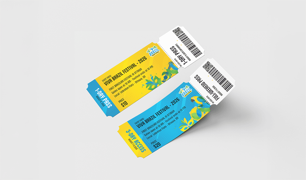
Image Gallery
A closer look at the visual outcomes of this project.