
Creative design works
Selected packaging projects
A selection of packaging concepts focused on user experience and visual identity.
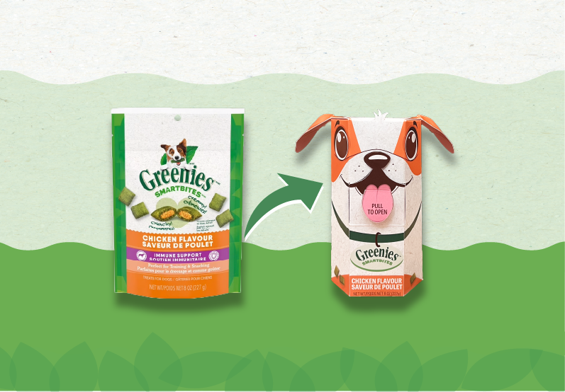
Greenies Smartbites
Packaging Redesign
A refreshed Greenies Smartbites packaging, more sustainable, practical and developed to improve visibility and better connect with pet owners.
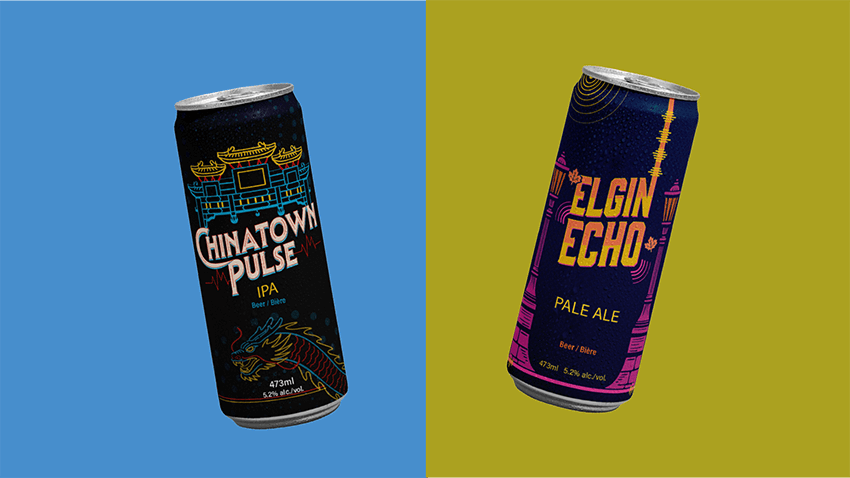
Ottawa-Inspired Beer Label
Beer labels that celebrate the spirit of Ottawa—each design capturing the character, energy, and stories of its unique neighbourhoods.
Selected branding projects
Crafting visual narratives that connect and communicate effectively.
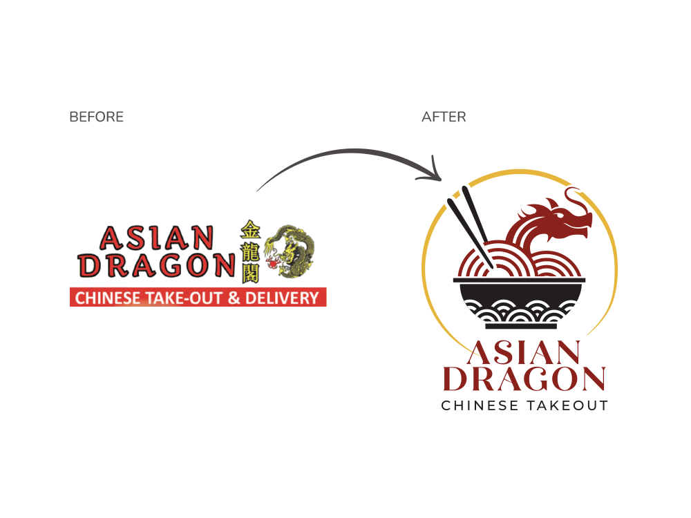
Asian Dragon -
Logo Redesign
A refreshed visual identity for Asian Dragon, designed to bring modern appeal while preserving its cultural essence.
Viva Brazil -
Event Branding
The goal of this project was to create a vibrant and cohesive visual system for a brazilian festival, VIVA BRAZIL, in Ottawa — a multi-day cultural event celebrating Brazilian music, food, art, and community. Bringing the spirit of Brazil to Ottawa with energy, colour and joy.

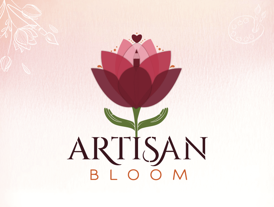
Artisan Bloom -
Event Branding
A branding project for a makers’ market inspired by the idea of “creativity in bloom,” connecting local artisans and the community through thoughtful, warm, and expressive design.
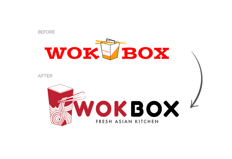
WOKBOX -
Logo Redesign
This redesign introduces a clever visual twist: noodles shaping the letters WOK. Bringing personality, meaning, and a stronger identity to Wok Box’s brand.
Selected UI/UX projects
Selected work that blends visual design, usability, and meaningful interaction.
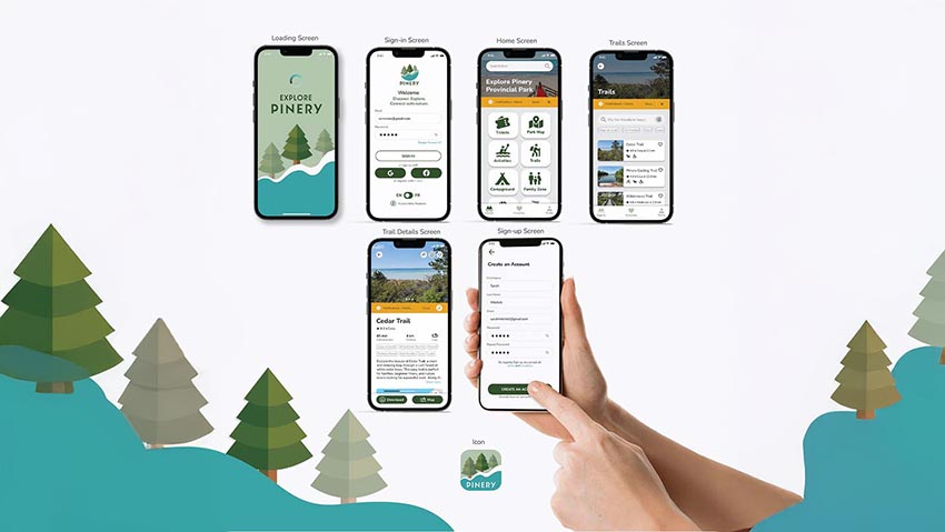
Explore Pinery -
App Redesign
A refreshed app experience addressing confusing navigation, inconsistent visuals, and limited accessibility. Resulting in a clearer, more cohesive digital guide for Pinery Provincial Park.
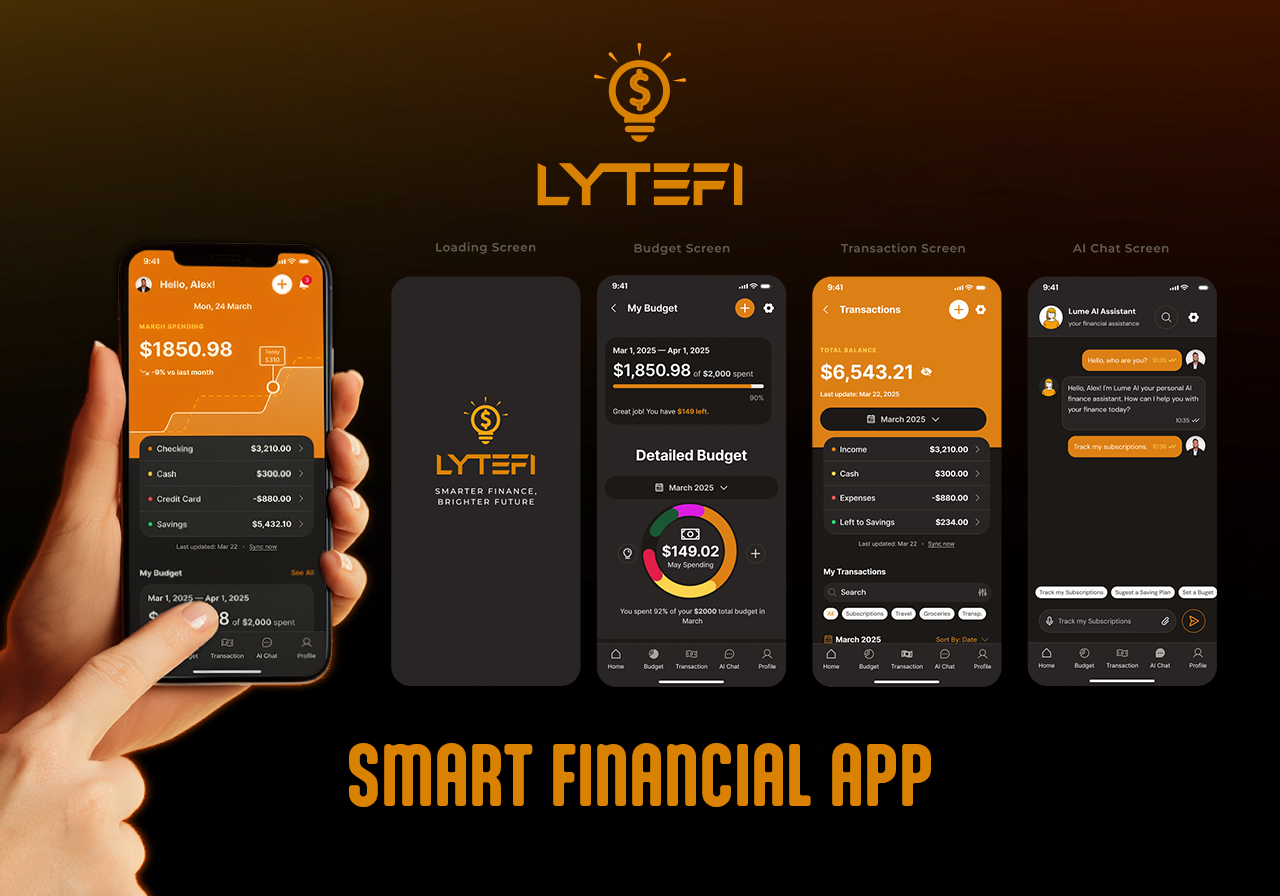
Lytefi - Smart Financial App
Lytefi is a conceptual financial app designed as an academic UX/UI project. The goal was to explore user-centered design solutions for simplifying personal finance through clear interfaces and intuitive interactions.
The project focuses on key features such as expense tracking, budgeting, goal-setting, and AI-assisted insights. Selected screens and a clickable prototype were developed to demonstrate information hierarchy, usability, and visual consistency.
This project highlights my ability to translate complex problems into accessible digital experiences using UX principles and UI design best practices.
Selected Typography projects
Wildforms - A Decorative Experiential Typeface
Wildforms is a decorative display typeface designed to transform typography into an exploratory visual experience.

Selected Motion Graphics projects
Bringing static ideas to life through movement and visual storytelling.
The Life Cycle of a Butterfly – Motion Explainer
This looping explainer video illustrates the butterfly life cycle in a clear, engaging paper-cutout style. By ensuring the last frame seamlessly matches the first, the animation reinforces the concept of continuous life cycles through smooth transitions and simplified motion."
The Chameleon – Seamless Loop
Seamless 2D character animation of a chameleon. This project was a technical exercise in timing and frame matching to create a perfect, infinite loop.
Deliverables: Motion Graphics Piece & Optimized GIF.
Rio de Janeiro – Motion Brand Opener
A dynamic opening sequence created for a visual identity project inspired by Rio de Janeiro. The animation brings together the city’s most iconic symbols, transforming static illustrations into a rhythmic narrative.
Software: After Effects, Illustrator
Rotoscoping – Capoeira Solo
This motion piece explores rotoscoping as a technique to translate live-action movement into expressive animation. The project features a solo capoeira performance ("Capoeira" is a visual tribute to the traditional Brazilian martial art that blends dance, acrobatics, and music), highlighting the fluidity, rhythm, and strength of the fighter’s movements.
Frame-by-frame rotoscoping was used to capture the dynamic gestures and body flow characteristic of capoeira, emphasizing motion accuracy, timing, and visual continuity. The result is a stylized animation that bridges real movement and graphic expression.
Software: Photoshop, After Effects
Under the Sea – After Effects 3D Exploration
An immersive journey into the depths. "Under the Sea" is a motion piece designed to transform flat elements into a vibrant, three-dimensional world. By focusing on the harmony between 3D space and organic movement, the project aims to capture the fluid beauty of the ocean floor.
The Goal: To push the boundaries of 2D assets within a 3D context, prioritizing visual appeal and atmospheric depth.
Software: Adobe After Effects, Illustrator
Character Animation - Cycling Girl
This project marks my first experience animating a character, focusing on movement, balance, and timing. The scene features a girl riding a bicycle, exploring how body mechanics and repetitive motion work together to create a cycle movement.
Software: Adobe After Effects, Illustrator
Bloom – FrameByFrame
"Bloom" is a delicate frame-by-frame animation that explores the beauty of organic growth. This project traces the journey of plants unfurling from simple forms into vibrant blossoms, all while subtly revealing the word "BLOOM." It was my initial venture into the meticulous process of hand-drawn animation, focusing on fluid transitions and natural movement.
Technique: Traditional Frame-by-Frame Animation.
Software: Procreate