WokBox - Logo Redesign
KeyWords
Wok, Box, Noodle, Bowl, Asian Cuisine, Tasty, Takeaway, Joyful, Clean, Modern, Chopsticks, Bamboo, Asian elements.
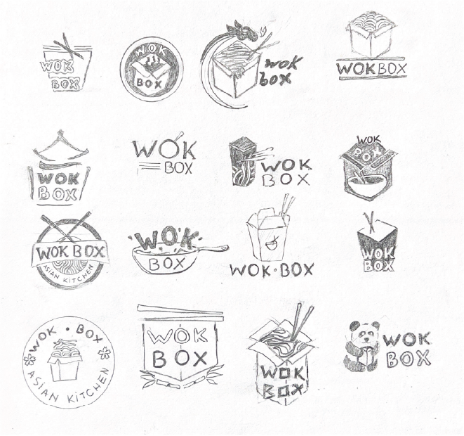
Sketches
The sketching phase focused on exploring a wide range of visual directions for the WokBox rebrand. I experimented with different box shapes, chopstick placements, and typography styles to capture the essence of fast, flavourful Asian cuisine. These early concepts helped define the brand’s personality—playful, bold, and modern.
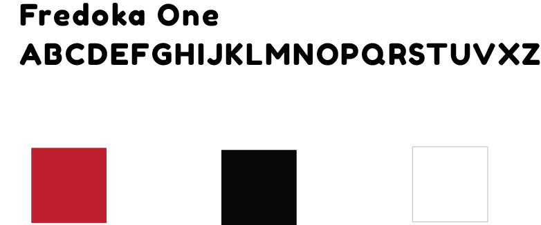
Font & Colour selection
The Fredoka One font has several differentials that make its aesthetics playful and friendly, making the design cheerful. Fredoka One features bold, rounded lettering, giving it a strong and attractive look, and making a strong visual impact. Despite its bold and playful nature, the font maintains good readability. The colors red, white and black were chosen to represent the brand’s identity and Asian aesthetics.
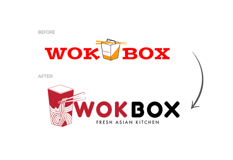
New Logo Explanation
In the redesigned logo, the box’s presence was retained, as it is the restaurant’s unique selling point; however, in a lighter and more modern style. Inside the box, Noodles and Chopsticks are depicted, strongly referencing Asian cuisine. The distinct feature is in the incorporation of the brand name (“WOK”) into the logo, which adds to the authenticity and conveys a sense of joy.
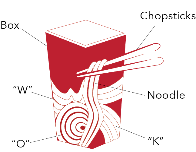
Final Concepts
The final WokBox logo highlights a clean, modern identity with a subtle yet meaningful design detail. Inside the takeout container, the flowing noodle illustration is crafted to form the word “WOK”, creating a clever visual connection between the product and the brand name. This hidden lettering adds personality and makes the mark more memorable without compromising simplicity.
The angled chopsticks introduce movement and guide the eye toward the wordmark, while the bold red-and-black palette reinforces brand recognition. The result is a playful, dynamic logo that visually communicates freshness, energy, and Asian flavour.
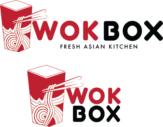
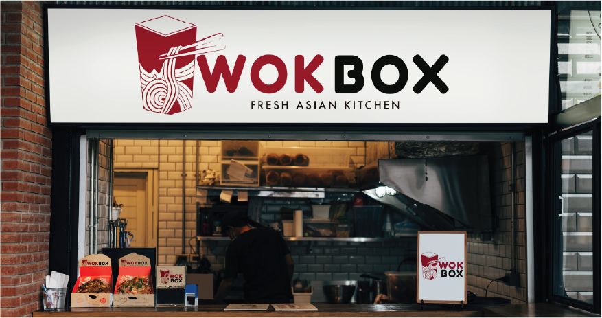
Application Example