Greenies - Packaging Redesign
The Challenge
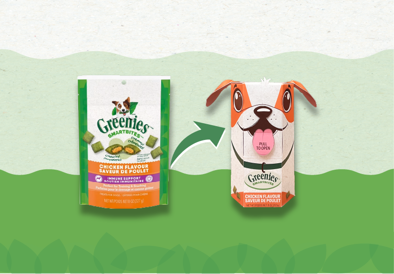
Redesign Greenies Smartbites packaging to be more sustainable, material-efficient, and optimized in size, without losing practicality, brand recognition or the fun, friendly personality.
The challenge also included finding the best structural solution so that the dieline minimizes waste, fits the treats more efficiently, and stands out on the shelves.
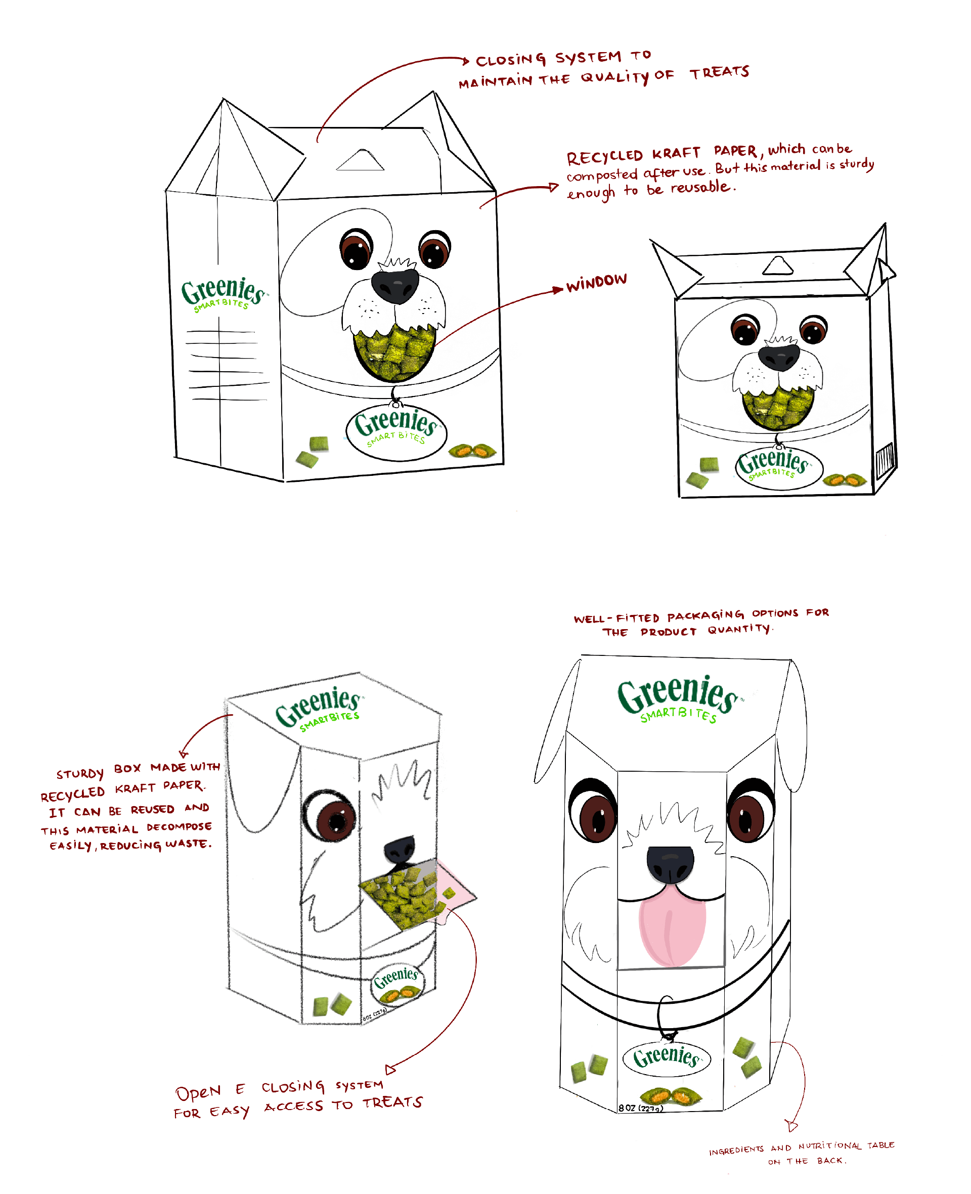
Sketches
Before moving into digital refinement, I explored multiple structural and visual directions through quick hand-drawn sketches. These early explorations helped define the overall form, sustainability considerations, and the visual personality of the new packaging. The sketches below present two initial concepts.
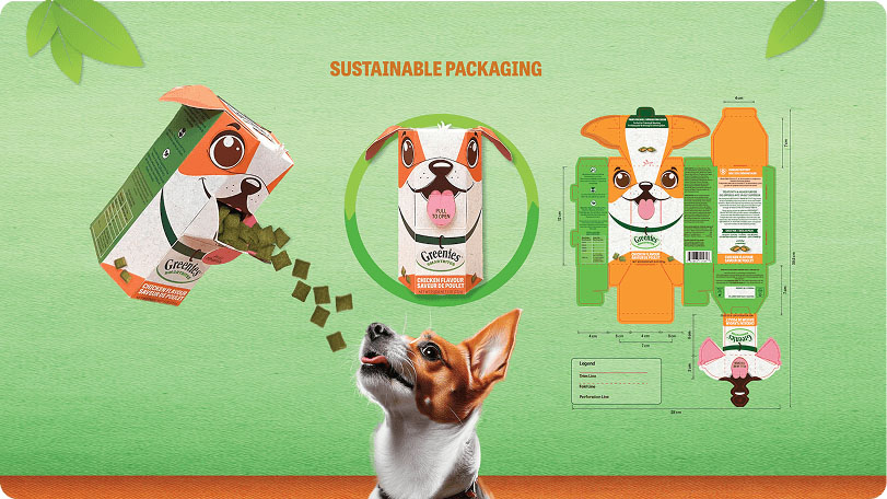
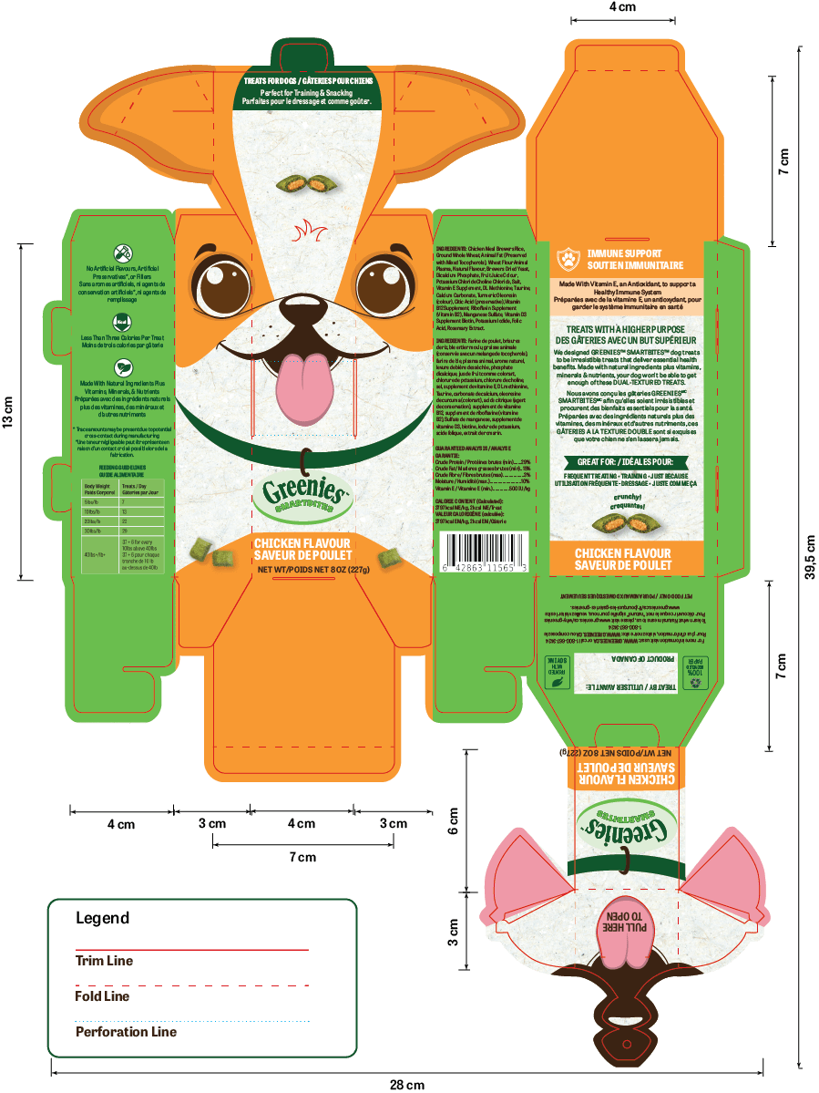
The Dieline Design
This dieline showcases the full structural layout of the redesigned Greenies Smartbites packaging, highlighting fold lines, trim areas, and die-cut details that bring the playful dog-shaped design to life. It demonstrates how functionality and visual storytelling were integrated into a single efficient structure, ensuring easy assembly, material optimization, and a memorable unboxing experience.
Poster
This poster highlights the redesigned Greenies Smartbites packaging, showcasing its sustainable structure, playful visual identity, and user-friendly opening system. The layout presents the new box in use, alongside the full dieline, emphasizing the suggested eco-friendly materials—100% recycled cardboard and soy-based ink—while reinforcing the product’s appeal to pet owners. The design blends functionality, sustainability, and emotional connection, making the new packaging stand out both on the shelf and in communication pieces.
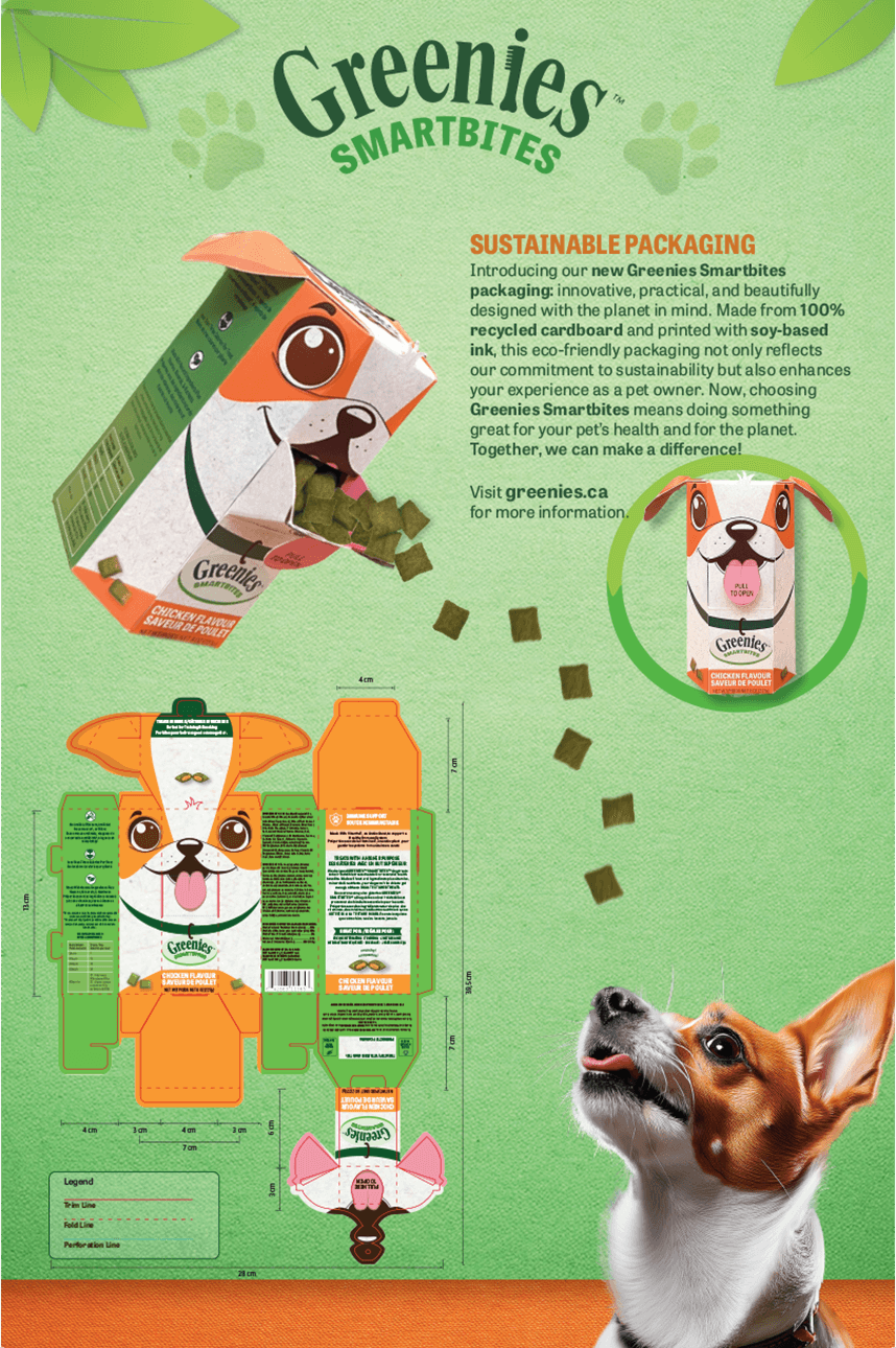
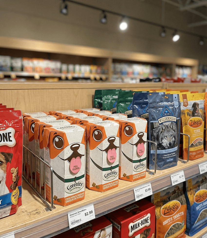
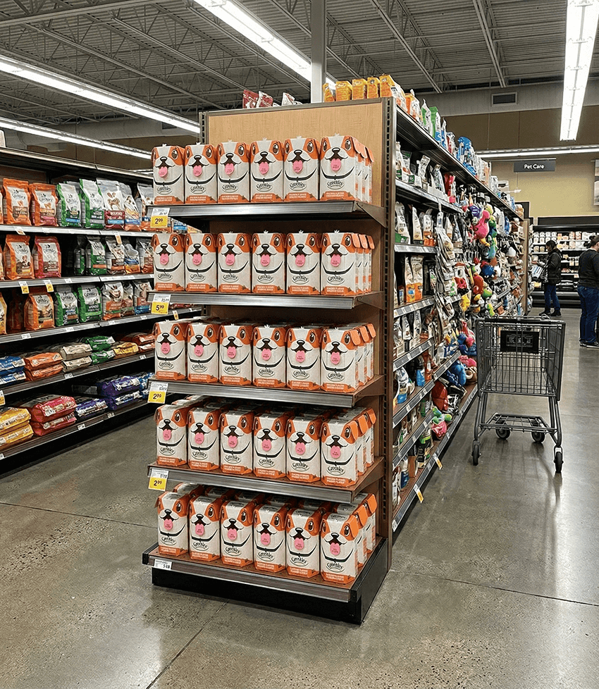
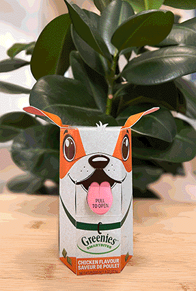
Image Gallery
A closer look at the visual outcomes of this project.