Ottawa-Inspired Beer Label
The Challenge
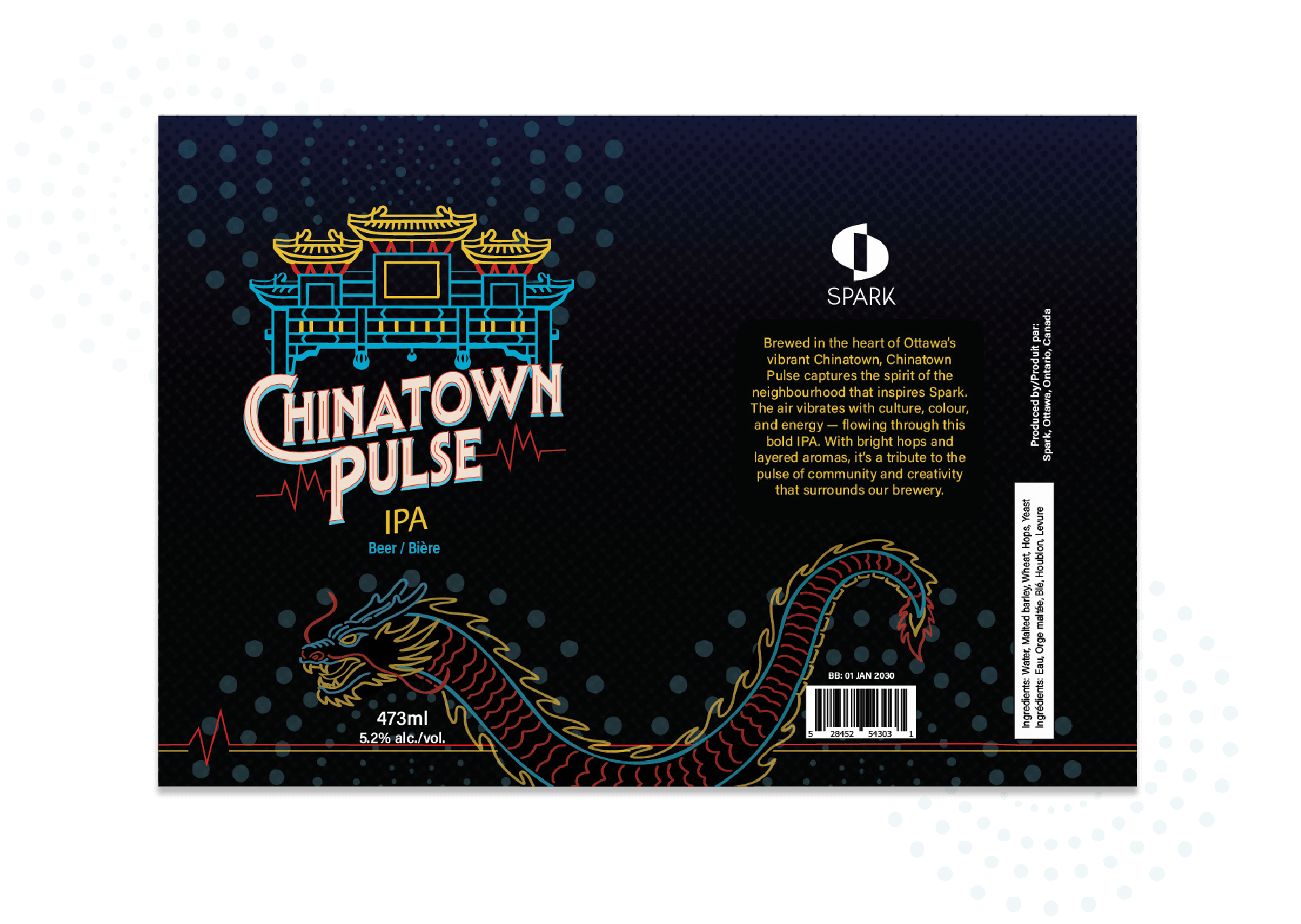
The challenge of this project involved more than capturing the identity of two Ottawa neighbourhoods. A key part of the process was determining the most effective way to design the label in a flat, 2D layout while ensuring that all elements—typography, illustrations, mandatory product information, and visual hierarchy—would align correctly once wrapped around the cylindrical surface of the can.
Another layer of challenge was translating the atmosphere of a neighbourhood, its sounds, colours, textures, and cultural influences, into a visually appealing, market-ready beer label.
For this project, typography became the central design element, guiding the visual personality of each beer. The type treatments needed to convey the energy of each neighbourhood while remaining legible and impactful.
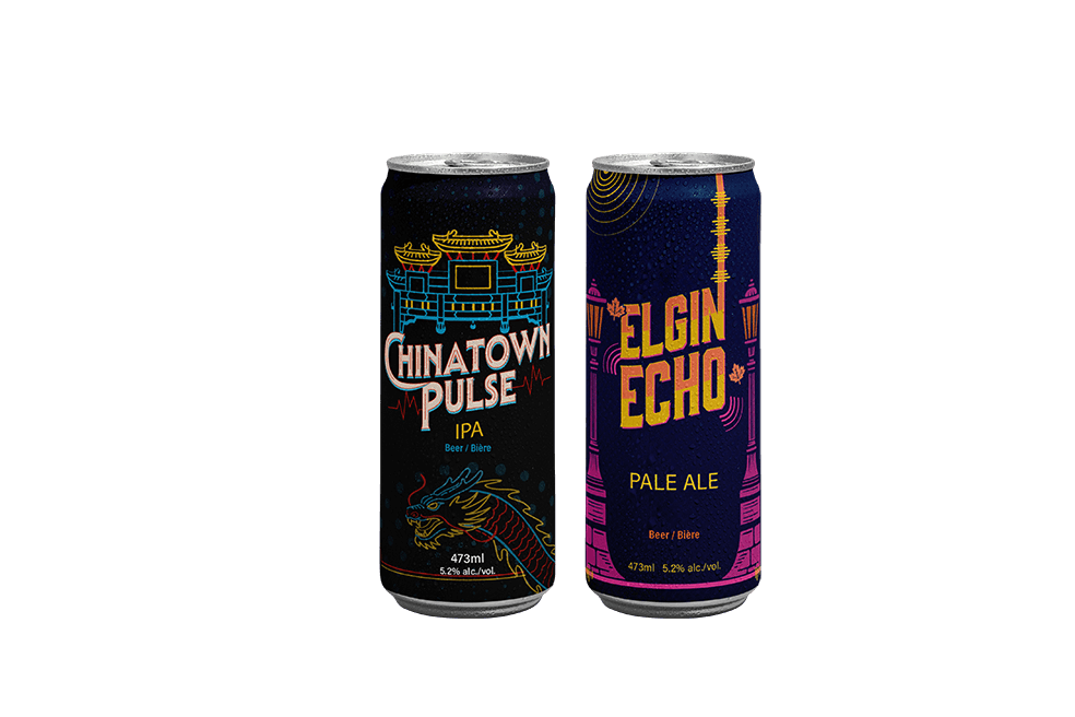
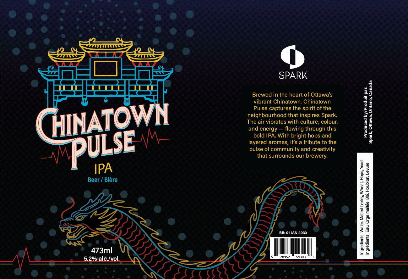
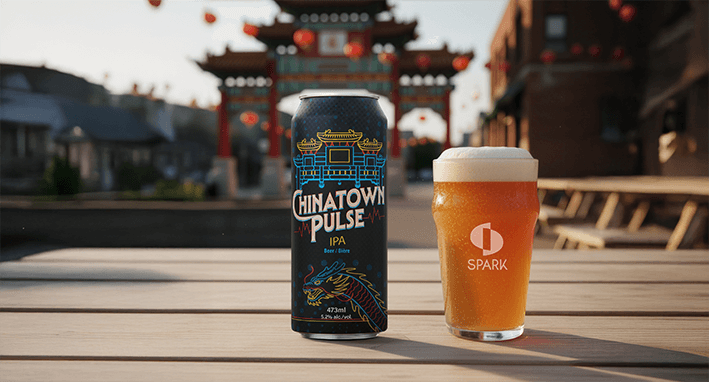
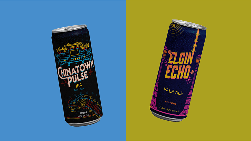
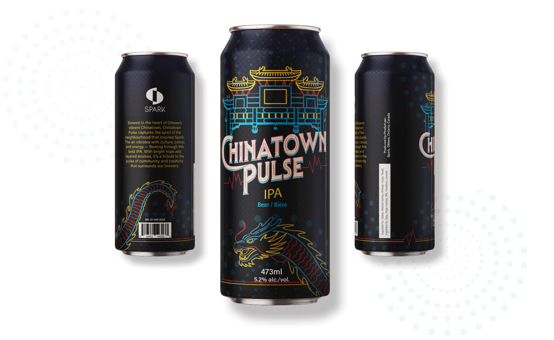
Chinatown Pulse
Inspired by the vibrant energy of Ottawa’s Chinatown, this label features linework of the iconic arch and a stylized dragon. The bold typography serves as the focal point, reinforcing the dynamic, lively character of the neighbourhood.
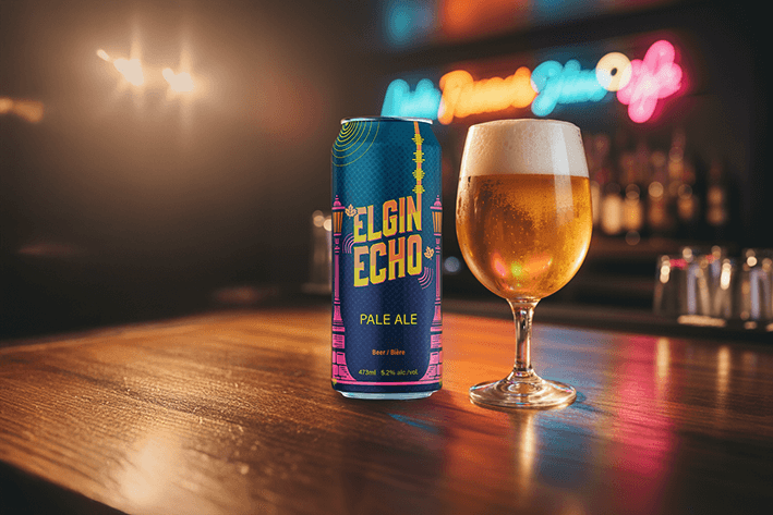
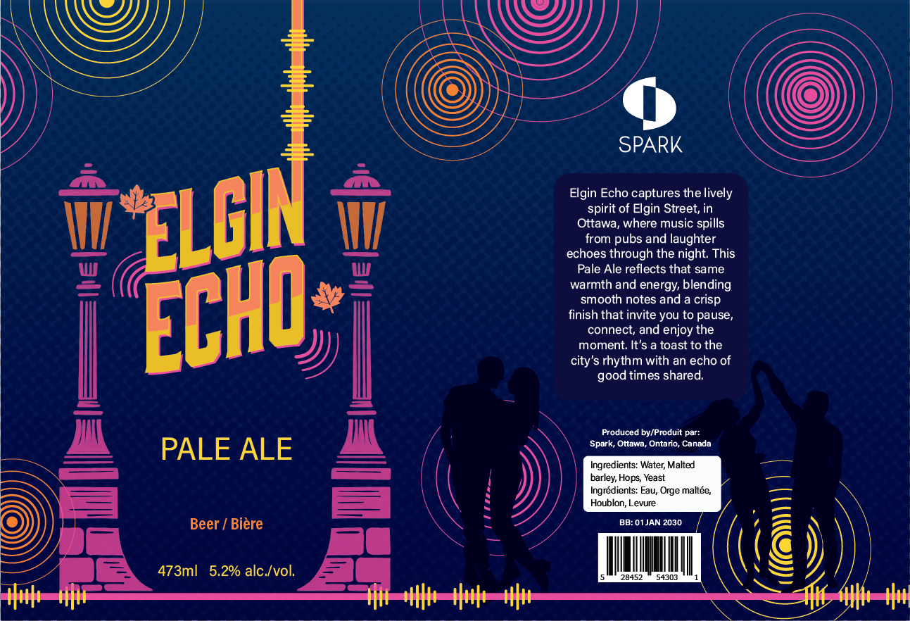
Elgin Echo
Designed to capture the rhythm of Elgin Street, this label uses warm gradients, sound-inspired linework, and recognizable street-lamp motifs. The typography takes center stage, appearing bold and rhythmic to reflect the music, nightlife, and artistic pulse of the area.
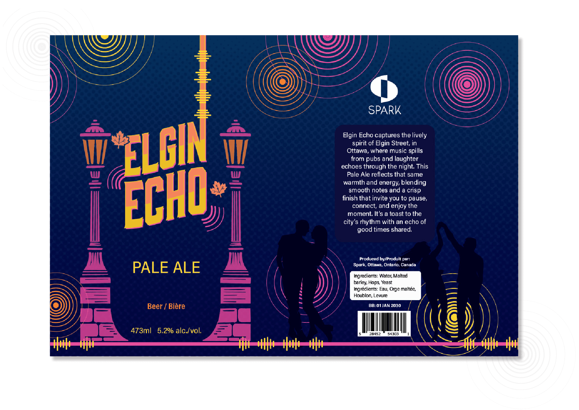
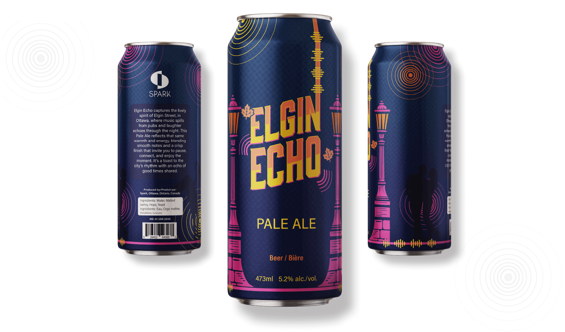
Image Gallery
A closer look at the visual outcomes of this project.