A Recognizable Identity for Asian Dragon
The Challenge
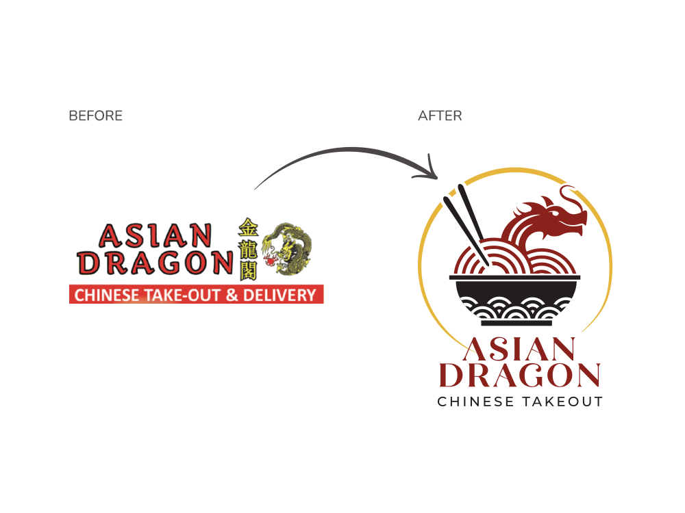
The challenge was to modernize the Asian Dragon brand while preserving its cultural essence. The original logo lacked visual cohesion and did not effectively communicate the restaurant’s identity. This project required developing a refreshed mark that balances tradition and contemporary appeal, improves legibility, and creates a stronger, more memorable presence.
The Process
The project began with a thorough research phase to better understand Asian Dragon’s positioning as a small Chinese takeout restaurant. This included analyzing and identifying direct competitors within the local takeout market, and defining the target audience. This research provided valuable insight into how the new identity should balance cultural authenticity with a contemporary visual language.
The design phase began with an extensive round of sketching. Approximately 30 initial concepts were generated, exploring different visual interpretations of dragons, bowls, noodles, and traditional motifs.
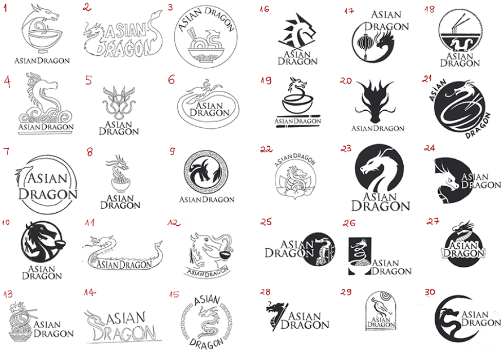
More Sketches
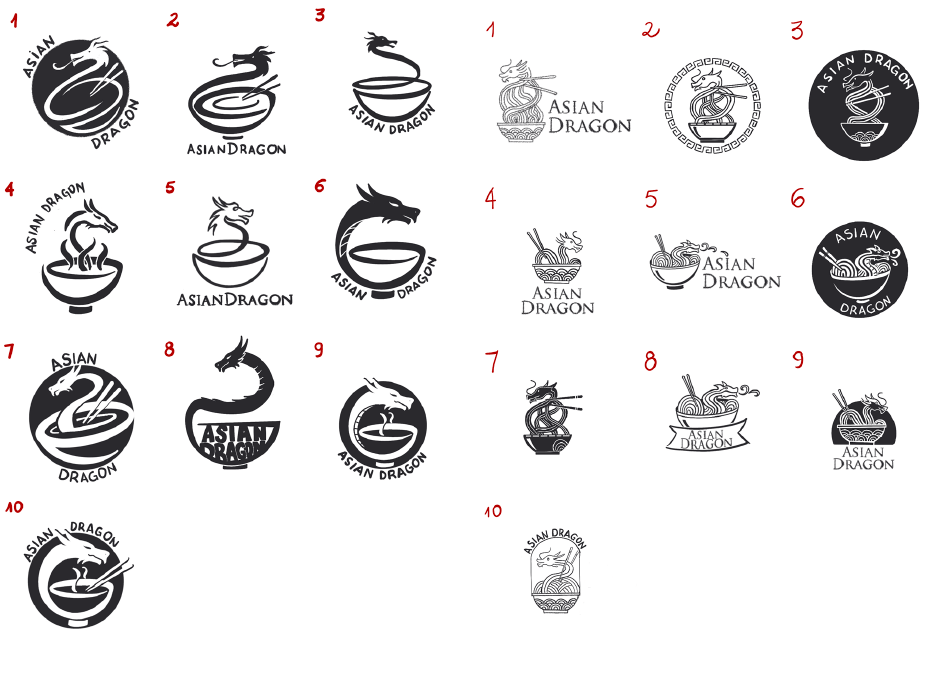
From these, two promising ideas were selected for a second round of refined sketch development. During this stage, multiple variations of each concept were explored to evaluate composition, symbolism, and scalability.
Digital Phase
Two of the refined sketches were chosen to move forward into the digital phase, where typography options and visual structure were tested. Among the selected typefaces were Trajan Sans and Quiche Flare.
Final Concepts
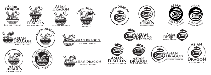
In the next stage, color was introduced into the two digital concepts. The palette included deep red, black, and, in one of the concepts, gold—colors traditionally associated with prosperity, warmth, and cultural richness in Asian aesthetics.
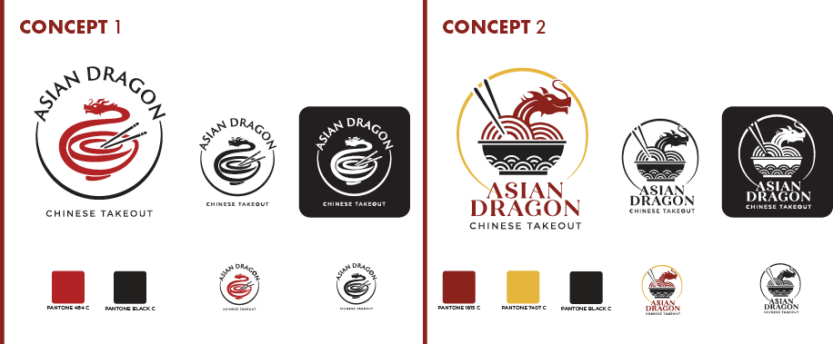
Solution
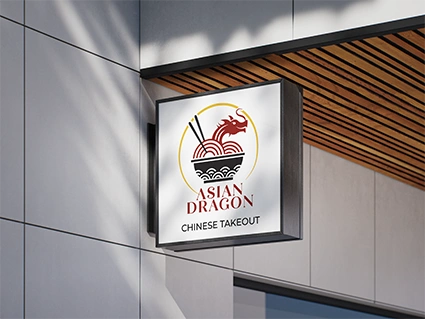
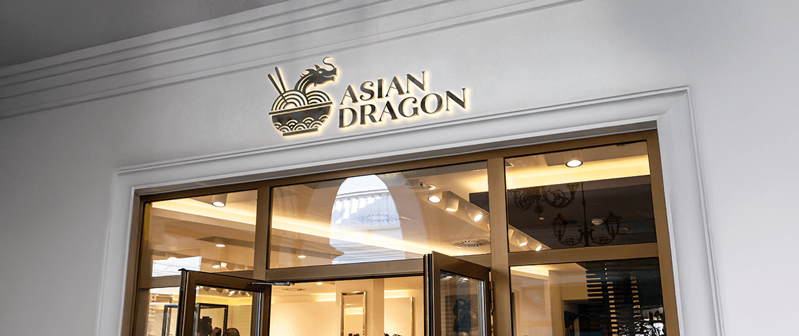
After presenting the concepts, Concept 2 was selected as the final direction for the brand. This solution features a dynamic combination of elements: a stylized dragon emerging from a bowl of noodles, framed by a golden circular brush stroke. The design merges cultural symbolism with a clean, contemporary aesthetic.
The chosen concept communicates energy and cultural identity. Its balance of illustration, color, and typography creates a memorable logo that works well across various applications and scales.
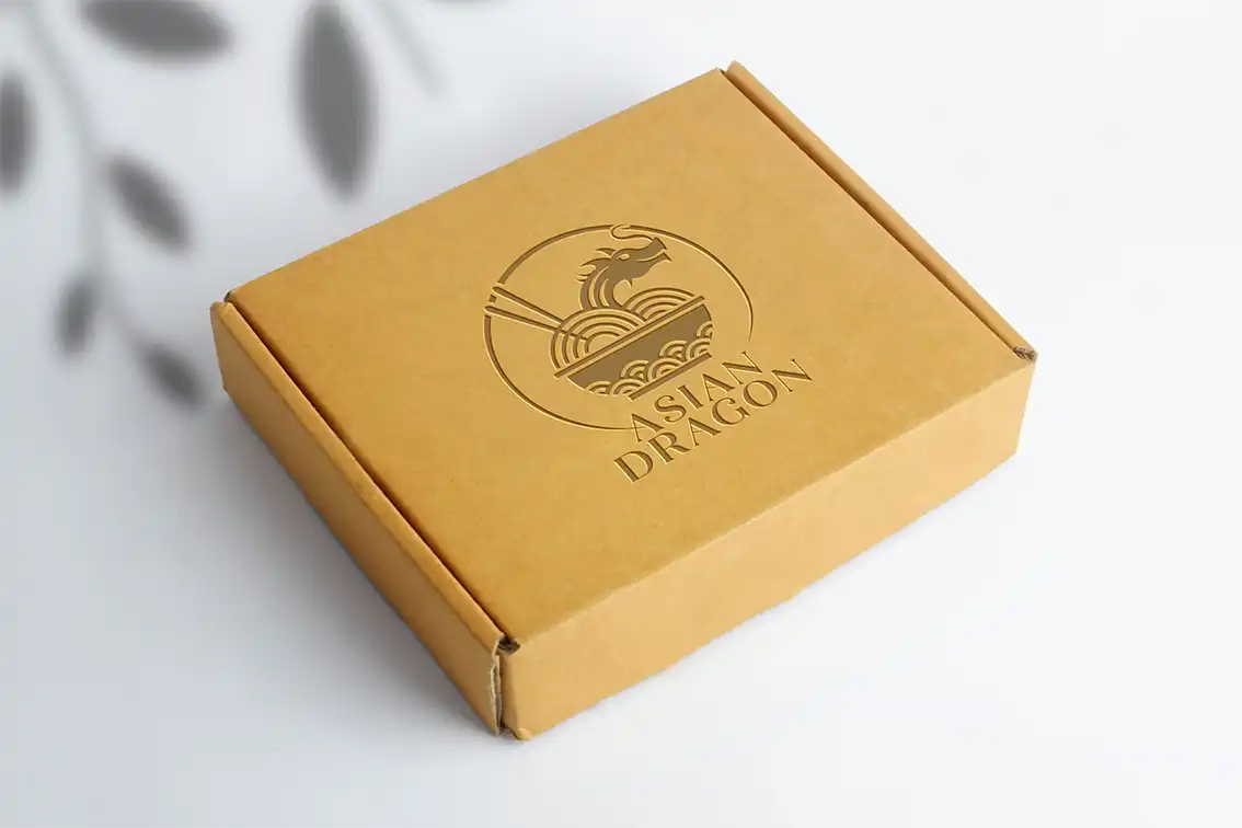
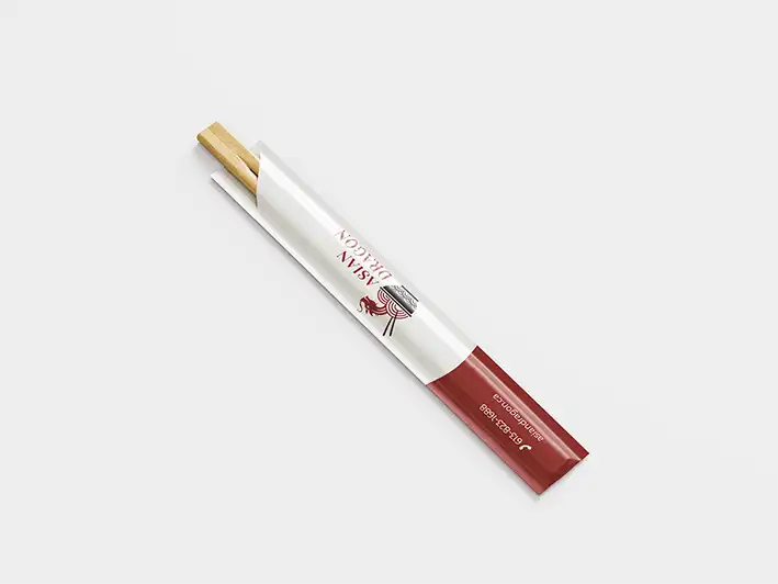
The final deliverables for the project included a stationery set, a logo guidelines document, and a series of mockups demonstrating the brand’s application across real-world touchpoints
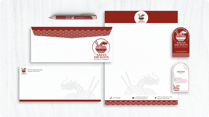
Image Gallery
A selection of visual explorations and final brand applications.